Work In Progress:Digital Painting
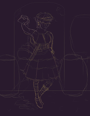
I started with a line drawing in Photoshop, a character standing in a low lit alley on a cobblestone street. I considering clothing design choices involving different textures that I could explore in low lighting, emphasizing shadows and wrinkles, as well as any sharp highlights.
I then made my general color choices for the character, keeping them in and around the orange range so that my shadows can complement them well with a base of purple. I also decided at this point, I'd try to recreate the feel of candle light.
Considering I'd never done a digital paint this detailed, I started with the head of the character, so I could establish more clearly for myself exactly where and how light would affect her before moving on to tackle more difficult things like the clothing. The lighting and color palette from the first Pirates of the Caribbean movie, and many Drew Struzan movie posters served as great reference on how to handle color and lighting. As for technique I'm a big believer in color picking, using a hard round brush, and smudging like nobody's business to get the right look, and interesting colors in between. Looking to push the orange and purple, and get some highlights in there soon as well.


Comments
Post a Comment